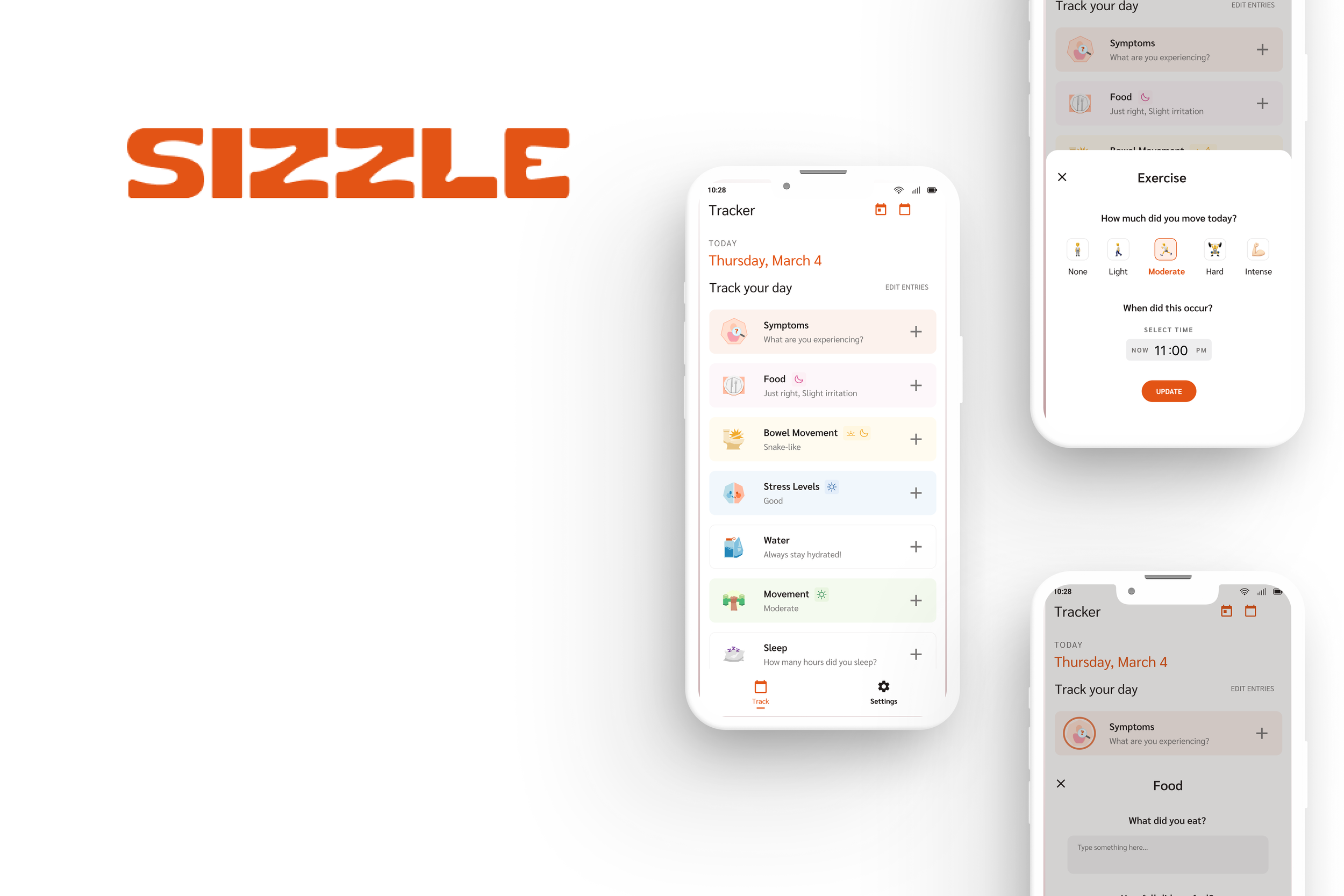
Sizzle: Data for Dietitians
My Role and Responsibilities
Lead Product Designer
User + Market Research
User Flows + Information Architecture
Wireframing
Visual Design
Usability Testing
Tools Used
Figma / Figjam
Linear
Google Suite
Google Meet
Slack
Team
Ryan (Founder + Head of Engineering)
Julian (Head of Product + Co-founder)
Sana (UI Designer)
Tiffany (UX/UI Intern)
Engineering Team (7 members)
At a Glance
Sizzle is a new web application built to bridge the gap between nutrition health specialists and patients by making data collection and analysis easy, engaging, and accurate.
Dietitians play a crucial role in promoting and maintaining good health for their patients. In order to provide the appropriate recommendations, however, they rely on a myriad of tracking methods in order to receive and analyze important patient lifestyle information.
We have learned, by talking to dietitians and experiencing it first-hand as patients, that the current software solutions out there are not specialized enough and do not reflect how dietitians and patients are using these tools in their day-to-day lives.
Problem Context
The Sizzle Solution
Helps Facilitate Better Patient Outcomes
Providers now have a wealth of centralized patient lifestyle information available at their fingertips, while patients engage with a tool that assists in forming and maintaining habits that support their overall health journey to help improve outcomes over time.
Providing Value for Small Businesses
Dietitians currently have to do a lot of advocating for funding from insurance companies currently. Most private practices offer expensive cash-based services as a result. However, having a tool that can better predict patient outcomes will give providers more leverage to change the industry and increase their value as small business owners and providers.
Project Overview: 2022 - 2024
Where I came in!
Research Phase
Coming into the project with some research and usability testing already completed, I needed to get up to speed on the competitive landscape. Most competitors focus on practice management and lack specialized features for dietary data analysis.
Design opportunity!
Competitor Matrix
User Interviews
The team interviewed over 40 healthcare providers in the nutrition space to learn more about their pain points working with these digital tools and find opportunities to improve the overall experience at the individual level, as well as within the industry as a whole:
Pain Points
A lot of effort spent taking and sharing detailed notes with clients
Difficulty receiving consistent/enough data from patients to make quality recommendations
Most food tracking tools are laborious to use or not sensitive enough for their clients’ needs
User Needs
A better way to keep clients engaged during the process
Easier way for patients to document and track metrics
More time to market services and find new clients
Visuals to sum up data analysis and share with patients to track progress
Notable Quotes
Insights
With a conversational approach to 1:1 sessions, the data collected is highly variable
Technology is very much integrated into the patient care experience, but expectations on patient engagement with lifestyle trackers is low
Behavior change and consistency are the most powerful indicators of positive treatment outcomes
Knowing this, How Might We…
facilitate the patient care process so that dietitians have enough quality data to work with?
*To answer this, I needed to understand the customer (aka the dietitan’s) journey.
Customer Journey Map
By mapping out this journey, we can effectively convey the platform's value proposition to dietitians like Sarah, highlighting how it streamlines data collection, enhances patient care, and supports practice growth.
This journey map also served as a guide for the design and development of the platform, ensuring that it addresses the specific needs and pain points of both our target audiences: dietitians and their patients.
*No personas??
What we did, was instead focus on design for the appropriate mental models of our target audience, and I interviewed a varied group of for consistent feedback during the ideation to keep our approach human-centered.
I determined over the course of the research phase that referring to a set of personas limited the scalability of the product.
User Flows
With a good idea of what our target audience looks like, the guiding force for the prioritization of product features was a set of the two most common use cases instead, and a focus was placed on the user journey and when the dietitian looked at the data set:
During the patient session
Right before patient sessions
Ideation Phase: UX/UI Improvement
After reviewing previous and new research findings and mapping out the ideal user flows I ran a heuristic and UX audit on the current Dashboard design, and determined where we could make improvements:
Current Problems
No symptom tracking
The previous patient experience asked for lifestyle information but did not ask about their symptoms. This resulted in more cognitive load on the part of the dietitians, who would have to still rely on the patients’ recall in conversations every 2-4 weeks.
Lack of cohesive visual design
Overly complex data visualizations, too many CTA’s, and too much text made the UI clunky and lacked intuitiveness for the users, when tested.
Additive tool
Only focusing on data analysis meant Sizzle would be just another digital tool for the dietitian to juggle between within their practice.
Solutions
New Tracking Category: Symptoms
Added a new tracking category for Symptoms and integrated this into the Dietitan Dashboard and Patient App, reducing cognitive load and improved user task completion rates by 50%.
The Sizzle Design System
The Product team created a new design system for Sizzle, following Material Design guidelines, which led to a 30% less user error and clearer navigation between pages.
Centralized Practice Features
Adding Note-taking and Secure Messaging features meant customers could spend more time interacting with Sizzle and less with competitors.
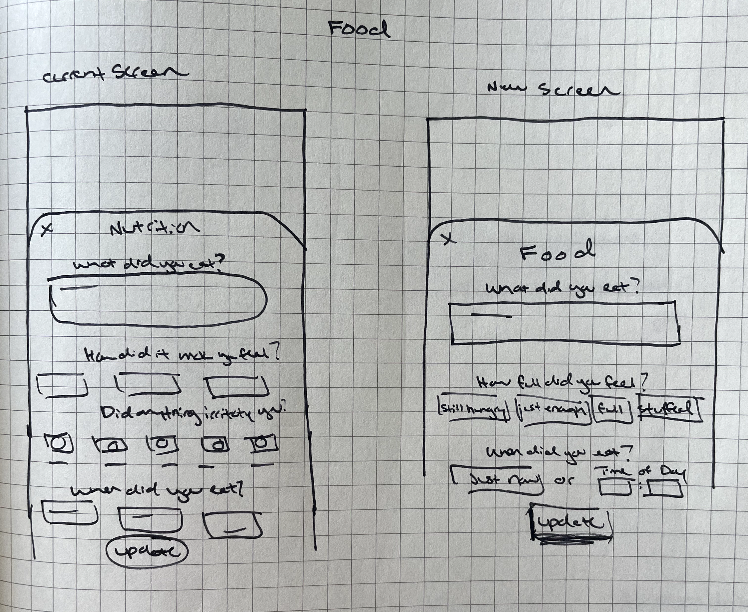
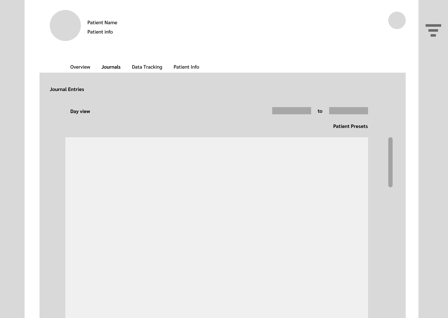
Design Phase: Wireframes
In order to shift the power into the hands of dietitians, we needed to design a tool that encouraged patients to track their lifestyle information on a regular basis.
Patient App
End-of-Day push notifications: encouraging patients to track before bed, even if they forgot throughout the day
Lessening the cognitive load:
emoji responses
2-5 selection options
minimal typing
everyday language
Patient Goals: a visible place to house and track patient progress
Dietitian Dashboard
Turning dietitians into data-tracking evangalists meant incorporating elements of the current “patient-led” treatment model into the dashboard.
Patient-led Alerts: allowing patients to bookmark a day or write a note on the app would trigger an indicator on the dashboard so the dietitian can review the most important dates between 1:1 sessions
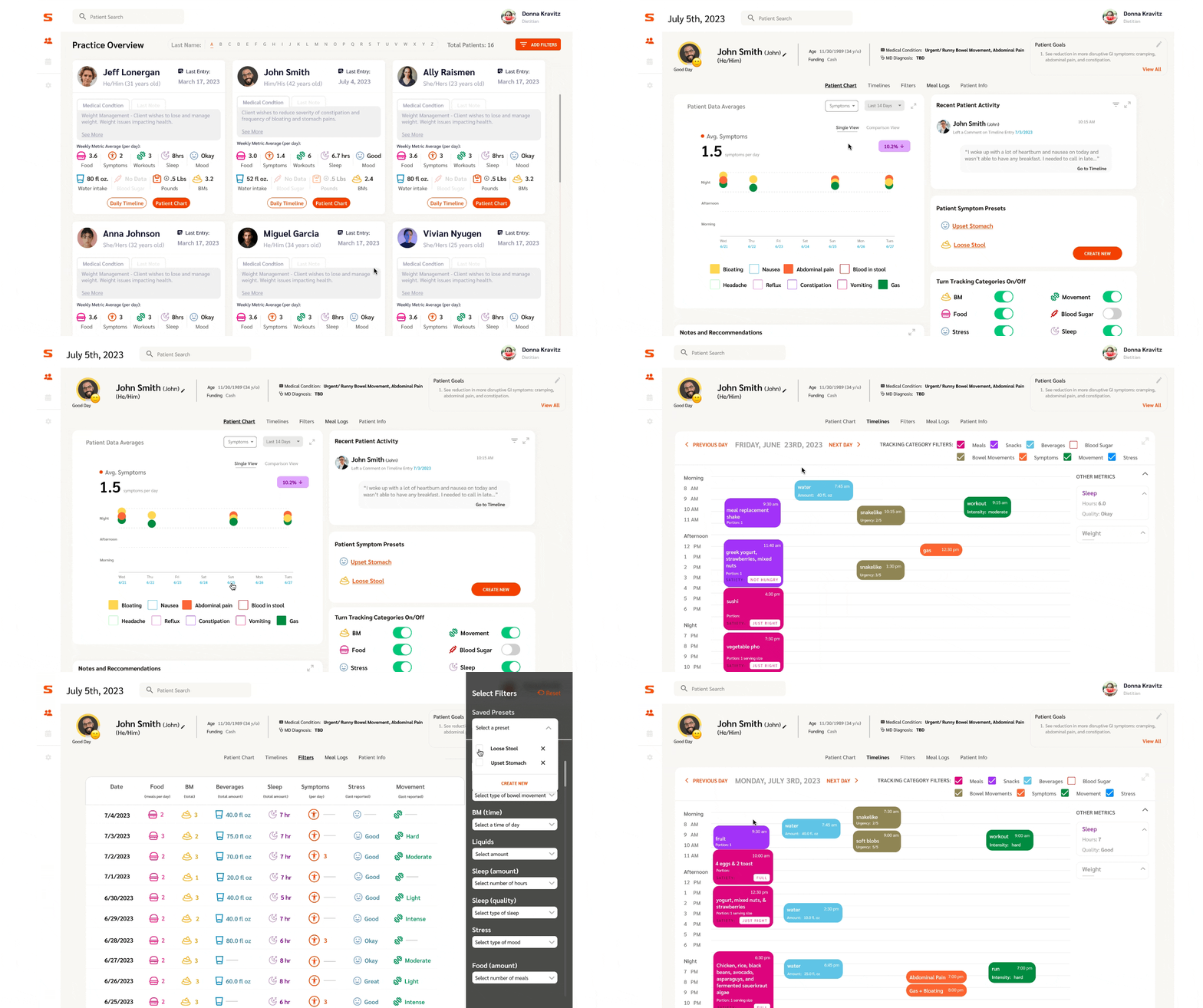
Timeline feature a new approach to food journaling - with so much information tracked per day, I designed a visual “timeline” of the patient’s activity and symptoms that creates a narrative of the day
Because of the segmented audience, we took our insights and made simultaneous updates to both the patient and dietitian apps. Taking this approach for the product’s development allowed us to offer a more personalized, relevant, and effective solution for both of our user populations.
Behavioral science concept at work: supporting user competence
People thrive on progress, so showing providers and patients their progress on goals is one way we plan to keep users engaged with the app long-term!
The Design System
Testing Phase
In order to catch any major issues before development handoff, we deliberately built test and learning cycles into the product development process. The most important of these was our “Real World Demo” which challenged 10 dietitians to run a mock patient session with our most complex dashboard prototype, with minimal assistance from the research team.
Findings:
100% task completion rate
70% had navigation issues
Complex data visualizations too confusing for participants
The High Fidelity Solution
Dietitian Dashboard.
After gathering the insights from our participants, we redesigned the Patient Chart, removing the unnecessary graphs, and replacing it with a calendar widget. This now allows us to direct users to the highest-value feature more quickly: the patient Timeline.
Patient App.
Matching the patient experience to the new and improved dashboard meant: including automatic timestamps on entries, adding Symptom tracking, and creating a Bookmarking feature to facilitate the patient-led practice of our customers.
Takeaways
-
Learning Moment: Confirmation Bias
We initially received lots of feedback to encourage us to use data visualizations (something I assumed would be a series of graphs, then some participants vocalized interest in graphs, so we designed them), but no one interacted with the graphs during an early prototype test (our "Real-World Demo"), so instead, we pivoted to a calendar widget that would highlight the dates patients bookmarked, so the most relevant and meaningful data to the dietitians would be visible and available first.
Moving forward, I will encourage the team to privately document their own takeaways from user interviews and tests, so the debrief doesn't result in an echo chamber of design decisions. Always plan an early prototype test to catch important feedback before investing in a full development!
-
Joining the team after the patient app was already designed meant fighting for changes that would create equilibrium between the new dashboard design and the initial version of the patient app. There is more to be done to strengthen the patient app design, especially regarding behavior change features, but before this, we will need user feedback…
Next Steps
If dietitians have enough quality data to make informed recommendations, they will eventually have enough empirical evidence to show value in tracking health metrics as a process. Therefore, we will be moving onto launching the patient experience in Winter 2023 to start collecting patient feedback.


